Three primary projects:
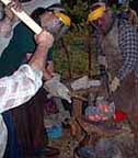
1) DARC to LAM 2012
At this point I've compiled the working budget. The contract is between Parks Canada and the Wareham Forge, who have approached us about mounting a living history program at L'Anse aux Meadows NHSC with tentative dates July 119 - 29. Needless to say, getting a contract team of eight (which may expand to as many as 14 +) 3000 km from our Central Ontario base is a major logistical effort. Waiting at this point to get a firm commitment on presentation dates - and budget approval.
2) Completing Vandy's Weaving Shed
This is a 'temporary' styled work building (frame on deck block supports) 8 x 16 base. It is intended to house the large four harness loom, with shelving for bulk weaving / textiles supplies. It is set to pull as much solar gain as possible via a pair of insulated sliding glass doors on the south face (scrounged from the dump!). In use it will plug in via an extension cord, and our old box stove will provide cold season heat.
 3/4 view, to roughly NE (from the corner of the main building). The slanted steel roof is set to make best use of the winter sun angle.
3) Revamping the Wareham Forge Web site
(And maybe learning PHP?) Once again I am working towards what will be pretty much a complete graphic revision of the (huge!) Wareham Forge web site. Part of my problem is that the site was started in the mid 1990's, when everyone was on slow dial up - and sites were primarily text based.
The world has changed, speeding up and getting ever more compact. I've rarely *removed* anything from the site, which currently holds a total of some 225 MB worth of files (over 100 pages and over 1000 images!)
The prototype work so far:
 This was my first design. This would be a standardized framework, with pull down menus to the left for the major topic areas. I personally *like* the use of dark backgrounds with lighter type as a bold graphic statement - however...
 This is where I'm leaning on version two. (The existing content for the individual information pages goes into the white box - which will even out the layout.) It has been suggested by a number of observers that the use of lighter backgrounds generally looks 'more professional'. (??)
On design & colour - the theory used on the whole web site:
(This may be stupid, but here is why.) I decided at the inception (some 15 years back) that the whole web site should 'look like me'. The reason was, 'if you don't like how I present myself, you will likely not like me (either) and maybe I'm not the one you should be working with'. This is a two pronged decision. It strengthens some individual people's choices, but admittedly limits in some other areas (professional architects as a possible example). Question for me has always been 'Do I want to work with that kind of person anyway??' (On the rare occasion I have been contacted from that quarter, it has NEVER worked out in the end.)
The individual topic sections are marked by shared backgrounds / colour shifts. Frankly, I have no clear idea if the casual user even notices (??)
I have made some limited attempt to design the site so as to keep it high in the Google rankings. I consistently sit 'above the fold' (top 5 - 6 results) for a large number of potential searches. But frankly, that ranking system changes so quickly, I have come to think that chasing the rankings is a fools game. I manage primarily on the longevity of the site (over 15 years now) and especially on the volume of content.
This all is a massive amount of work. My pay off is that the internet is my primary source of new commissions.


No comments:
Post a Comment